人口金字塔
-
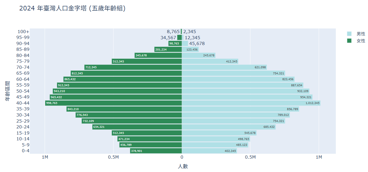
台灣2024年各年齡層人口(population_taiwan_group2024_5year.csv)
import pandas as pd
import plotly.graph_objs as go
import plotly.io as pio

# 針對 Colab 的顯示設定
pio.renderers.default = 'colab'

# 1. 讀取資料 (使用2024年人口以五歲為區間的資料)
df = pd.read_csv('population_taiwan_groups2024_5year.csv')

# 2. 準備繪圖數據
y軸標籤 = df['Age_Group']    # 年齡層標籤 (0-4, 5-9...)
男性資料 = df['Male']       # 男性人數
女性資料 = df['Female'] * -1 # 女性人數取負值,往左延伸

# 3. 建立圖表
trace_men = go.Bar(
    y = y軸標籤,
    x = 男性資料,
    orientation = 'h',
    name = '男性',
    hoverinfo = 'text+name',
    # 懸停顯示時將負數轉回正數顯示
    text = df['Male'].apply(lambda x: f'{x:,}'),
    marker = dict(color = 'powderblue')
)

trace_women = go.Bar(
    y = y軸標籤,
    x = 女性資料,
    orientation = 'h',
    name = '女性',
    # 懸停顯示時將負數轉回正數顯示
    text = df['Female'].apply(lambda x: f'{x:,}'),
    hoverinfo = 'text+name',
    marker = dict(color = 'seagreen')
)
traces = [trace_men, trace_women]

# 4. 建立 Layout
layout = go.Layout(
    title = '2024 年臺灣人口金字塔 (五歲年齡組)',
    barmode = 'overlay', # 讓兩組長條圖重疊在中間線兩側
    xaxis = dict(
        title = '人數',
        # 設定 X 軸刻度顯示為正數
        tickvals = [-1000000, -500000, 0, 500000, 1000000],
        ticktext = ['1M', '0.5M', '0', '0.5M', '1M']
    ),
    yaxis = dict(title = '年齡區間'),
    bargap = 0.1 # 條形圖間距
)

# 5. 組合並顯示
fig = go.Figure(traces, layout=layout)
fig.show()
執行結果