三級產業分佈
-
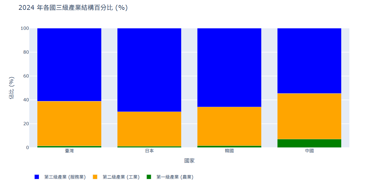
三級產業資料(economic_sectors_2024.csv)
import pandas as pd
import plotly.graph_objs as go
import plotly.io as pio

# 初始化 Colab 顯示模式
pio.renderers.default = 'colab'

# 1. 讀取 CSV 資料
df = pd.read_csv('economic_sectors_2024.csv')

# 2. 提取資料列
國家名稱 = df['Country']
第一級產業 = df['Primary_Sector']
第二級產業 = df['Secondary_Sector']
第三級產業 = df['Tertiary_Sector']

# 3. 建立圖表資料
trace1 = go.Bar(
    x = 國家名稱,
    y = 第一級產業,
    name = '第一級產業 (農業)',
    marker = dict(color = 'green') # 綠色
)
trace2 = go.Bar(
    x = 國家名稱,
    y = 第二級產業,
    name = '第二級產業 (工業)',
    marker = dict(color = 'orange') # 橘色
)
trace3 = go.Bar(
    x = 國家名稱,
    y = 第三級產業,
    name = '第三級產業 (服務業)',
    marker = dict(color = 'blue') # 藍色
)
traces=[trace1, trace2, trace3]

# 4. 設定佈局 (Layout)
layout = go.Layout(
    title = '2024 年各國三級產業結構百分比 (%)',
    xaxis = {'title': '國家'},
    yaxis = {'title': '佔比 (%)', 'range': [0, 100]},
    barmode = 'stack', # 堆疊模式
    legend = {'orientation': 'h', 'y': -0.2} # 圖例放下方
)

# 5. 組合圖表並顯示
fig = go.Figure(traces, layout=layout)
fig.show()
執行結果