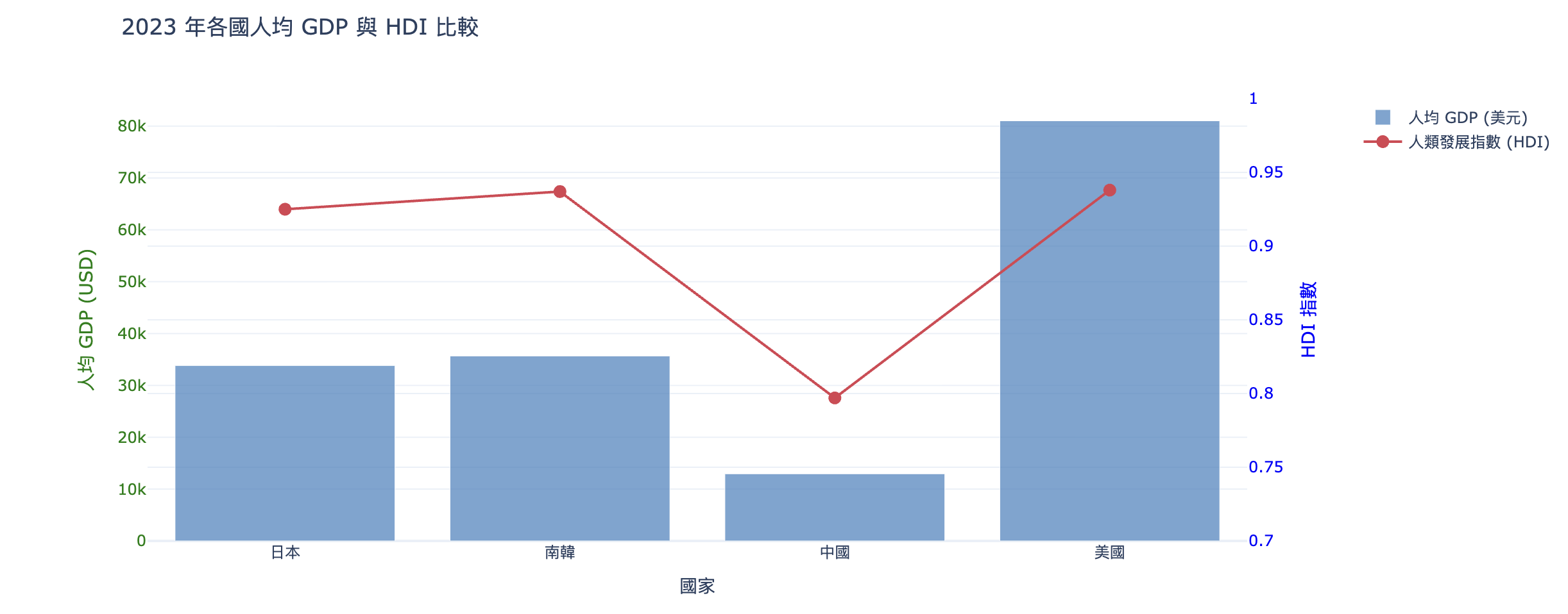
人均GDP與HDI
-
世界GDP資料下載(gdp_world2024.csv)
世界人口數資料下載(population_world2024.csv)
世界HDI指數(HDI2023.csv)
import pandas as pd
import plotly.graph_objs as go
import plotly.io as pio

# 初始化 Colab 顯示模式
pio.renderers.default = 'colab'

# 1. 讀取 CSV 檔案
df_hdi = pd.read_csv('HDI2023.csv')
df_gdp = pd.read_csv('gdp_world2024.csv')
df_pop = pd.read_csv('population_world2024.csv')

# 2. 定義國家對照表 (用於處理不同檔案中的名稱差異)
# name: 顯示用中文名, gdp_name: GDP/Pop 檔案中的名稱, hdi_name: HDI 檔案中的名稱
目標國家 = [
    {'name': '日本', 'gdp_name': 'Japan', 'hdi_name': 'Japan'},
    {'name': '南韓', 'gdp_name': 'Korea, Rep.', 'hdi_name': 'South Korea'},
    {'name': '中國', 'gdp_name': 'China', 'hdi_name': 'China'},
    {'name': '美國', 'gdp_name': 'United States', 'hdi_name': 'United States'}
]

目標年份 = '2023'
country_labels = []
avg_gdp_list = []
hdi_list = []

# 3. 提取資料並計算
for c in 目標國家:
    # 提取 GDP (從 gdp_world2024.csv)
    gdp_val = df_gdp[df_gdp['Country Name'] == c['gdp_name']][目標年份].values[0]

    # 提取 人口 (從 population_world2024.csv)
    pop_val = df_pop[df_pop['Country Name'] == c['gdp_name']][目標年份].values[0]

    # 提取 HDI (從 HDI2023.csv)
    hdi_val = df_hdi[(df_hdi['Entity'] == c['hdi_name']) &
                         (df_hdi['Year'] == int(目標年份))]['Human Development Index'].values[0]

    # 計算人均 GDP 並存入列表
    country_labels.append(c['name'])
    avg_gdp_list.append(gdp_val / pop_val)
    hdi_list.append(hdi_val)

# 4. 繪製雙軸圖表
# Trace 1: 人均 GDP (左軸 - 長條圖)
trace1 = go.Bar(
    x = country_labels,
    y = avg_gdp_list,
    name = '人均 GDP (美元)',
    marker = dict(color='rgba(55, 128, 191, 0.7)')
)

# Trace 2: HDI 指數 (右軸 - 折線圖)
trace2 = go.Scatter(
    x = country_labels,
    y = hdi_list,
    name = '人類發展指數 (HDI)',
    mode = 'lines+markers',
    yaxis = 'y2',
    marker = dict(color='rgb(219, 64, 82)', size=10)
)

traces = [trace1, trace2]

# 5. 設定雙軸 Layout
layout = go.Layout(
    title = f'{目標年份} 年各國人均 GDP 與 HDI 比較',
    xaxis = dict(title='國家'),
    yaxis = dict(
        title = '人均 GDP (USD)',
        titlefont = dict(color='green'),
        tickfont = dict(color='green')
    ),
    yaxis2 = dict(
        title = 'HDI 指數',
        titlefont = dict(color='blue'),
        tickfont = dict(color='blue'),
        overlaying = 'y',
        side = 'right',
        range = [0.7, 1.0] # 固定範圍方便觀察差異
    ),
    legend = dict(x=1.1, y=1),
    template = 'plotly_white'
)

# 6. 組合並顯示
fig = go.Figure(traces, layout=layout)
fig.show()
執行結果